Thursday, 14 January 2010

drawinnngs

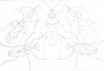
I wanted to try doing some more detailed drawings and different layouts. The individual shapes of the insects below give the image a effective contrast from one another.
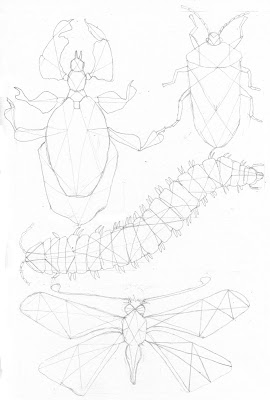
I started making my drawings with a symmetrical quality, however i don't know wether this suits the insects as the insects themselves are not perfectly symmetrical.
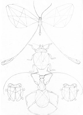
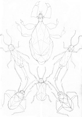


I decided to extend the lines from the insects to create a camouflage. I think with more lines would disguise the insects even more.
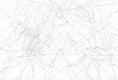
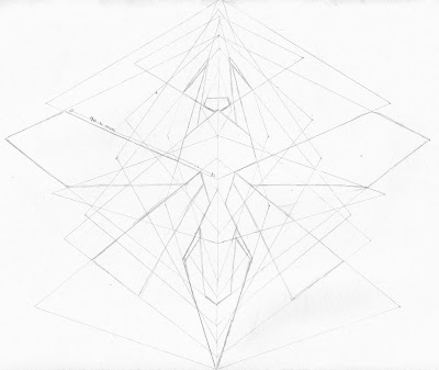


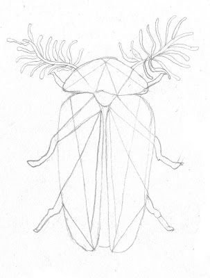
This geometry style layout would work better if  the outline of the insect was less defined. I like that its quite different from the other drawings as i drew the lines first and then found the shapes within them to create the insect.
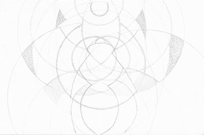

I tried a curved approach which i like some parts of however i don't like the whole image i much prefer the image before with straight lines.

Thursday, 10 December 2009

more -----------------------


Above is another cutting however this time i wanted to try a different insect and use more layers. I like how that more layers gave the image more depth.

I really like looking at each cutting layer separately, the shapes look really effective and interesting.


Above are variations of cuttings however i wanted to try different types of papers. The wasp includes graph, lined paper and the inside patterns of envelopes. The second bug layers are all from a newspaper. I like the effect of the different sections of text and the wasps different papers layers they both create confusion distracting your form seeing the insect.

Tuesday, 8 December 2009

winged insects

I thought i better try some different insects as i felt it was getting quite repetitive using the same image. Winged insects seemed the best way forward! i had a play with different colour selections to see what effect they gave.


I made another kaleidoscope inspired piece. i really like how the wings attach to the next insect. I can't quite decide which of the kaleido images i prefer. I think it would be quite interesting to have a set of three different categories of insects as this would give different patternes and shapes.


cutting time

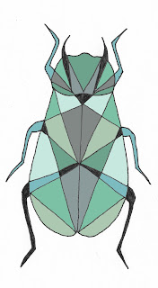
I Really like the final outcome of these paper cut outs that i have done. With the piece below I kept the colour shades similar as i think the book i did had to many different colours which i felt didn't suit the image.


I really liked the though of being able to walk around the cut outs and decided to hang up this pice form the different angles it produced interesting photographs, however from the front the image did not line up at all. This process proved to be quite difficult to get each page in the correct position. Maybe if they were closer together it may have been easier.


I tried a different method of cutting out the shapes by leaving part of it attached so it bends upwards away from the main image. I think the it gives off a really nice effect thats quite different from the cutting i did before.

I tried using three shades of blue and combining them to make a more tonal image.


Thursday, 3 December 2009

kaleidoscope bugs

I went on to try a more precise design using the kaleidoscope theme. i really like the image as it appears to be a repetitive pattern going a round in a circle, however as you look round it closer you see the different forms of the insects and patterns within them.


I tried repeating the image above in various ways however i feel neither show much substance to carry on experimenting with. Out of the two i prefer the one below as it gives the effect of an kaleidoscope.

Instead of using colour to feel the shapes i used a many patterns to make a more detailed piece that i feel has more potential.

bug book

I made a little cut out book with triangular shapes within it's body to take the kaleidoscope idea further and try it as cut out images to build up the bug's shape. This was just a experiment to see what it would look like and give me a sense if i made it more detailed and added more insects. I like the outcome, however I would definitely be more choosy over colours if i investigated further into this.


bugs bugs bugs and more bugs!

I have moved away from using ink for a bit as i think there are many other mediums which would create and interesting effect. This image was just playing around with how i could attach each insects to each other.

This circle of bugs i drew really reminds me of a kaleidoscope and if i introduced colour and more detail i think it would produce really effective piece.


I am really pleased with the detail and the organic flows of the lines creating a quite art Nouveau style.

I tried shapes much more angular before creating more of a kaleidoscope effect. I quite like this image but i think i prefer the more natural shapes to disguise the insect as if it was in it's natural habitat.